Impact of the pandemic on the European Union
The COVID-19 pandemic in Spain. First wave: from the first cases to the end of June 2020
Monographs from the National Atlas of Spain.
Thematic structure > Global context of the COVID-19 pandemic > Impact of the pandemic on the European Union
The European Union is very heterogeneous from a geographical point of view. Four different geographical aspects show this complexity and warrant analysis: population density, population age, urban system and main airports. This geographical diversity becomes a key explanatory factor when studying the pandemic’s differing impact on the different States, regions and municipalities.
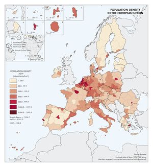
The first map shows the Population density in the European Union. There is a sharp contrast between some very densely populated areas and other less inhabited areas. However, it shall be borne in mind that densities are conditioned by the size of the territorial units represented. At one end of the scale, some regions have a density over 500 inhabitants/km2. One of these areas is the axis that runs from the Netherlands to northern Italy, encompassing a set of highly urbanised and developed territories that also happen to be the wealthiest and most urbanised area in Europe; these are the regions that French geographer Roger Brunet named the Blue Banana at the end of the 1980s. At the other end of the scale, some regions have a density under 50 inhabitants/km2, and although they may be few in number, they occupy large territories in the north of the continent (much of Sweden, Finland and the Baltic States), in the southwest [the inland regions in Spain, Alentejo region in Portugal, and Limousin and Corsica (Corse) in France], in the southeast (various parts of Greece and Bulgaria) and in the northwest of Ireland. A priori, it seems reasonable to set a direct relationship between high population density and the ease at which any infectious disease may spread. And the most densely populated areas of the Union did, indeed, record a high number of COVID-19 cases. However, within the most populated regions, the different speed with which the decision on lockdowns was taken led to the effects of the pandemic being more severe in some regions [e.g. Lombardy (Lombardia), Île de France…] than in others [e.g. Baden-Württemberg, Bavaria (Bayern)…].
The population density map shall be combined with the Population over the age of 65 in the European Union map, which shows a part of the population that, if infected, has a higher morbidity rate due to the age. This map is clearly different to the population density map. The regions that stand out for having a higher number of people over the age of 65 are those that form the Iberian Atlantic Arc [especially Alentejo, Galicia, Asturias and Castile and León (Castilla y León)], the hinterland of France (especially Poitou-Charentes and Limousin), the north of Italy [more specifically Piedmont (Piemonte), Liguria, Friuli-Venezia-Giulia, Tuscany (Toscana) and Umbria], several regions in eastern Germany [Saxony (Sachsen), Saxony-Anhalt (Sachsen-Anhalt) and Thuringia (Thüringen)], a couple in Greece [Epirus (Épeiros) and the Ionian Islands (Iónia nisiá)] and one in Bulgaria (Northwest). In the case of the Iberian regions, older sex-age pyramids are combined with low demographic densities and a highly dispersed population, making the provision of healthcare for older adults even more challenging.
If we look at the map showing the Most populous cities in the European Union, we may observe that the high rates of urbanisation in Europe translate to a network of numerous medium-sized (by global standards) cities in close proximity to one another. This urban pattern is totally different to the megacities in Asia, Africa, and the Americas. It is particularly prominent in the aforementioned Blue Banana, where several cities with over half a million inhabitants are located just a short distance from one another and are included in different Member States. The density of flows between these cities played a significant role in easing the spread of the virus across the continent, which led to the roll-out of coordinated measures throughout the twenty-seven EU States. However, unlike in other continents, the size and morphology of the European urban system allowed the Authorities to quarantine the cities and neighbourhoods with the highest incidence of infection with relative ease, and this helped to control the pandemic in the heart of Europe.
The map showing the Main airports in the European Union tries to highlight the virus’ points of access to the Union from abroad, i.e. the international airports where measures were gradually introduced to slow down the arrival of passengers, first from Asia, then from South Africa, Brazil and the United Kingdom. It also shows the other airports in the network, which subsequently helped to spread the pandemic internally. Air transport flows in the European Union have two main components: business travel and leisure travel. Travel for work-related reasons is more common in the airports located in the main urban areas. Falls in the number of passengers at these airports as a result of lockdowns and reduced mobility were considerable. Frankfurt airport went from 70 million passengers in 2019 to 19 million in 2020; Madrid from 60 million in 2019 to 17 million in 2020; and Munich (München) from 48 million in 2019 to 11 million in 2020. By contrast, airports on the Mediterranean coast and the Canary Islands (islas Canarias) rely heavily on tourism. However, given that the outbreak of the virus happened in winter, during months of low tourist activity, these airports were less impacted by restrictions on mobility during the initial weeks of the pandemic. In June 2020, when the incidence of the virus had been reduced, lockdown measures were scaled-back and the summer tourist season began, some regional administrations in these areas –particularly the island regions– ventured to test tourist corridors, in which virus control systems at airports played a crucial role.
Having analysed the four geographical aspects that show the internal heterogeneity of the European Union and played a decisive role in the way the COVID-19 pandemic impacted the different territories to varying degrees, the statistics have been synthesised on the maps and graphs included on the next page to show the impact of the pandemic across the European Union.
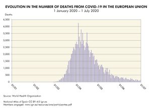
The map showing the COVID-19 cases in the European Union reveals how the pandemic spread throughout the territory from January to June 2020. The growth of the disease was explosive during the month of March and the worst figures were registered in April. This may possibly be related to the fact that the European Union had underestimated the risk of a new virus emerging in China, so by the time the pandemic was declared, European health and governance systems were overwhelmed. However, the decision to impose a policy of strict lockdowns in the vast majority of Member States gradually succeeded in reducing the number of infections afterwards. An analysis of the impact by State shows that the severity of the pandemic was uneven: the eastern States were less affected (Slovakia and Hungary recorded the lowest figures); western States that reacted quickly were able to limit the impact (e.g. Portugal, Germany and France); other western States recorded the highest figures (Spain, Ireland, Belgium and Sweden had the highest incidence rates).
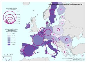
The map showing the Deaths from COVID-19 in the European Union reveals a general trend that correlates with the patterns for COVID-19 cases. However, the number of deaths lags behind the number of cases by a couple of weeks. The only significant variation is to be found in Italy, which was the first State to register a community transmission. They reacted quickly and, therefore, managed to limit the transmission figures somewhat. Nevertheless, Italy recorded very high death rates. This is because there were few means to combat the disease during the first weeks of the pandemic, which meant the number of seriously ill and deceased was particularly high at this early stage (at one point, the mortality rate in Italy lied over 50 per 100,000 inhabitants).
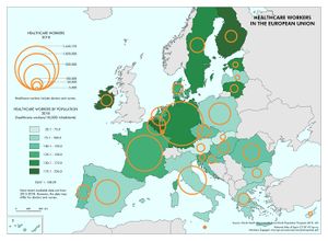
The last map shows the number of Healthcare workers in the European Union. In general, Europe is globally renowned for having solid and well-equipped healthcare systems, which translate to the continent’s high level of well-being. However, the availability of doctors and nurses is uneven: higher in the northern States (Finland, Sweden, Ireland, Germany, Belgium, Estonia and Lithuania), and lower in the southern and eastern States (for this indicator, Spain and Italy have similar figures to Bulgaria, possibly as a result of the cuts on their health budgets in the wake of the double recession from 2008-2013).
Co-authorship of the text in Spanish: Agustín Gámir Orueta, Rubén C. Lois González, Ángel Miramontes Carballada y Ana Paula Santana Rodrigues. See the list of members engaged
You can download the complete publication The COVID-19 pandemic in Spain. First wave: from the first cases to the end of June 2020 in Libros Digitales del ANE site.


